Posted by
Oli Gardner on July 26th, 2010 at 11:06 am
Online Marketing
As with that
other program,
the first and most critical step is admitting you actually have a problem. So go ahead. Shout it out loud so your coworkers can hear:
“My name is Earl. My conversion rate sucks, and I can't stop sending expensive PPC traffic to my homepage.”
Feel better? You should.
You just passed the “unofficial” first test of landing page rehab, and now you’re ready to take 12 little steps that’ll lift you from that river in Egypt (denial?!?) to a higher place on the conversion charts. This is the intervention your landing pages have been crying out for, so take a deep breath... and let’s get started.
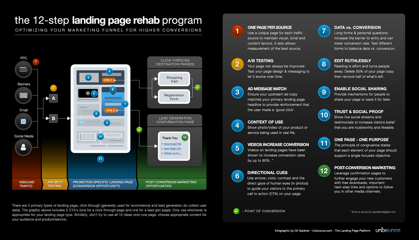
Study the 12-step infographic to see where each step in the program should be applied to the conversion funnel.
 (Click to image view full size)
View Full size version |
Download a poster sized version (24"x13")
MEASURING YOUR PROGRESS - THE CONVERSION SCORECARD
Before we begin, we need
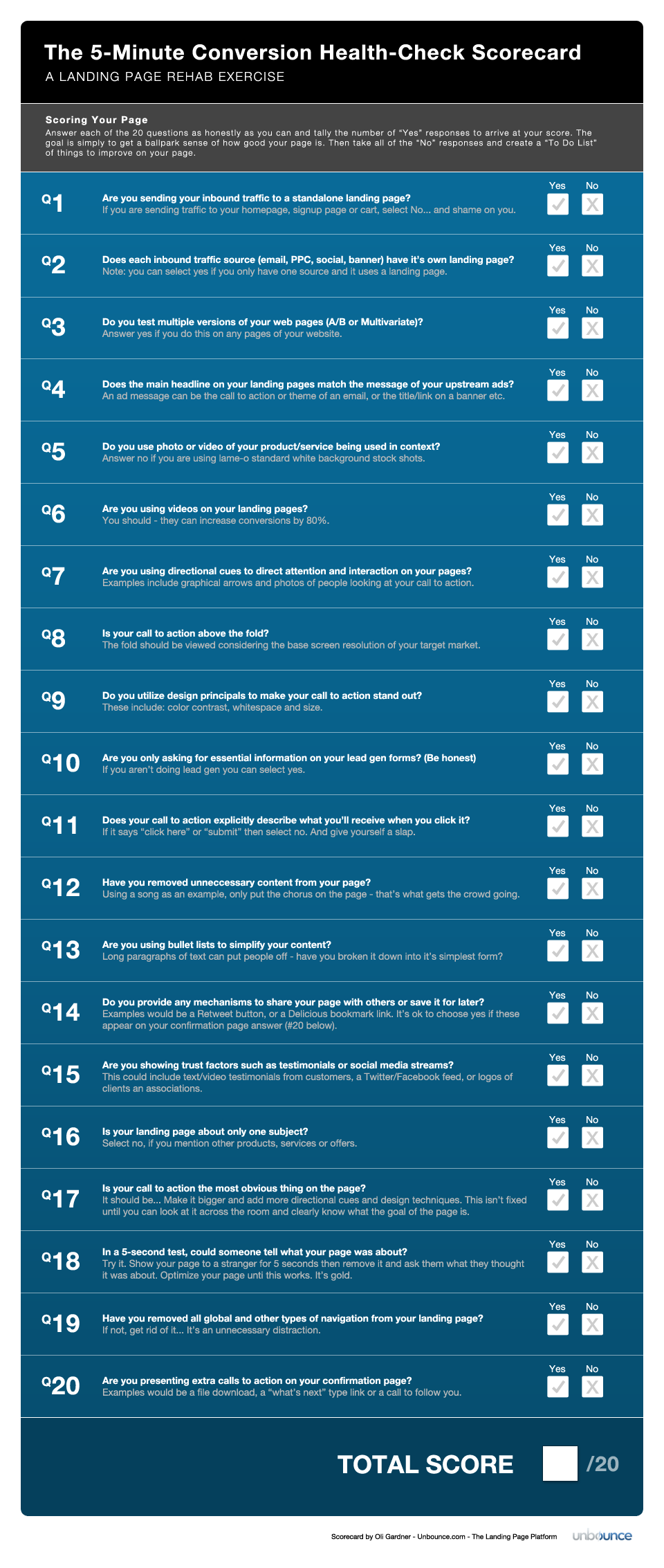
a quick breathalyzer test to get some baseline metrics in place and measure how effective your treatment program is. The conversion scorecard can be used whether you’re using a standalone landing page for your marketing campaigns or sending traffic directly to a page on your website (homepage, shopping cart or registration page) - although it is geared slightly more towards the standalone variety.
 (Click to view or print the full size graphic with the complete set of 20 questions on it.)
Scoring your page
(Click to view or print the full size graphic with the complete set of 20 questions on it.)
Scoring your page
Answer each of the 20 questions as honestly as you can and tally the number of “Yes” responses to arrive at your score. The goal is simply to get a ballpark sense of how good your page is. Then take all of the “No” responses and create a “To Do List” of things to improve on your page. You’ll find some guidance and tips for making these improvements as you follow the 12-step program below.
Remember that after you leave the rehab clinic and have made some positive changes to your conversion funnel, you should revisit the scorecard to measure your improvements.
View and print out the full sized Conversion Scorecard
STARTING THE 12-STEP PROGRAM
STEP 1 - Use a Separate Landing Page for each Inbound Traffic Source
The principles of inbound marketing are founded on facilitating multiple streams of traffic. Examples include PPC, email, banner ads and social media. There are two key reasons why you should be using a separate landing page for each source:
- Each inbound medium has it’s only unique style and limitations. Using separate pages allows you to sync up the visual and tonal qualities with the source. Email for instance can contain a lot more information that a tweet, so the amount of extra information your landing page needs to communicate is inherently different. Imagine also that one of your inbound streams suddenly requires a different offer (perhaps a 20% discount for an affiliate) - with only one page you would have to show this change to all inbound sources.
- With measurement comes accountability. With separate funnel flows, you can measure the effectiveness of each inbound stream and focus your efforts on the one(s) that convert the best.
Doctors Orders: Start thinking of each inbound source as it’s own mini campaign. You want to have multiple rivers bringing boats to your port (rather than many tributaries feeding one river). Print out the ads for each inbound source (PPC, email, banners, social media) and spend time observing their differences - size, tone, language and visual weight. This will help you design appropriate landing pages.
STEP 2 - A/B Test Your Landing Pages
A/B testing is the process of splitting your traffic between a series of pages to see which performs the best. Anne Holland’s
WhichTestWon.com is a fun site that shows examples of A/B tests and lets you pick which version you think would produce the highest conversion rate.
On a corporate level, testing helps to remove conjecture and subjective argument from the boardroom and is a great way of understanding your customers (which messaging and design do they respond to best). It should be done as an iterative process - think evolution vs. revolution.
FACT: Your landing page can always be better. Just like a plant, it needs ongoing attention for best results.
Some online tools/services for testing:
Doctors Orders: Take the plunge and get a tool set up so you are at least able to start testing your landing pages. Then the fun part of trying new ideas and experimenting can come.
STEP 3 - Match Your Landing Page Message to the Upstream Ad
If the primary headline of your landing page doesn’t match the copy on your ad you’ll be getting a lot of action on your browser’s back button. As an example, consider the following:
Bad message match
Ad: Get 20% off a MacBook Pro
Landing page message: Welcome to Bobby’s Computer Store
Good message match
Ad: Get 20% off a MacBook Pro
Landing page message: Get 20% off a Macbook Pro at Bobby’s Computer Store
Seems obvious right? The problem is that most inbound traffic gets sent to company homepages where the messaging is necessarily generic. Using a targeted standalone landing page is key to reinforcing the customer’s belief that they made a “good click”. You will also get a better quality score and thus a lower cost-per-click from Google AdWords if your message match is strong (this extends to the entire content on the page which should be congruent with the headline message).
Bonus tip: If you are driving social media traffic, you can enhance the “social message match” by including an appropriate social icon on your landing page to further reinforce the connection between the source and destination.
Doctors Orders: Learning to construct your campaigns in the right order can help you ensure good message match. Start with a concept based on communicating your product/service/offer to your target market. Come up with your promotional headline and landing page content, then work on a series of ads that closely match the headline. If you do it the other way round (ad first), you are forced into building from what might be the wrong foundation.
STEP 4 - Context of Use
They say a picture is worth a thousand words. A better picture is one where your product or service is shown being used in context. Salespeople will tell you to sell the fire, not the fire extinguisher - the point being that you need to illustrate the need in order to develop desire for the solution.
Effective landing pages use photography and video to provide evidence of how your product or service solves a real problem.
A statement like “Our vacuum cleaner is so powerful it can suck up a bag of nails” beside a stock photo of the product against a white background is far less likely to convert than a video showing (and letting you hear) the vacuum cleaner actually doing the job. An example using photography could show a fold-up ladder in two states. Being tucked into a small cupboard by it’s owner, and then extended to show the owner reaching onto high shelves to retrieve something. Simply showing it in it’s intended context of use will improve your sales.
Would you really have bought a ShamWow without seeing it in action?
Doctors Orders: Take your product or service and actually use it for real (you’d be surprised how many people haven’t even used the item they’re selling). This will help you to understand and visualize how it should be presented in your photography and videos. If it's an online tool, try observing someone else using it.
STEP 5 - Use Videos to Increase Engagement & Conversions
According to a study by
eyeviewdigital.com, the use of video can increase your conversions rates by as much as 80%. By providing users with a passive engagement mechanism you can keep them on your page longer allowing your brand message to seep into their subconscious.
Warning: don’t just throw up a poorly animated Powerpoint presentation - nobody will watch it.
If you are peddling a physical product, show people using it as mentioned in step 4. If it’s an online tool, provide a demo of the primary features while narrating the benefits of it’s use (don’t show every step, make it a highlight reel). If you offer a service, put yourself front and center and communicate directly with your viewers. Make eye contact for maximum engagement and make use of directional cues to guide them to your intended conversion goal. Great videos do this by having the host look and point outside the frame towards other elements on the page - bringing the whole page into the experience.
Usability best practices say to never auto play a video as the audio shock can make people hit the back button immediately, especially if they are in a sound sensitive environment - like most offices. However, this is something you should test on your visitors. My advice if you want to start the video automatically would be to at least allow a shot delay before it starts, and make the controls very obvious in case someone wants to mute or pause the video.
(This is a decent example of a nice pause and transition into video -
http://raw.glow.com/dms1825/ - warning: the alerts when you try to leave the page aren’t so nice).
Doctors Orders: If you don’t use video yet, plan to start soon. For online product demos, try recording a screencast using software like
Jing. It’s really simple and cost effective. Once you get a feel for it you can upgrade to more elaborate tools with stronger editing and post-production features. Audio is very important - write a script before you record so you’re not bumbling your way through and try to use an external mic for better quality.
STEP 6 - Use Directional Cues to Lead the Way
Imagine an airport without the expertly placed wayfinding signs and maps - it would be chaos. If you’ve visited the emergency room at a hospital, you might be familiar with the colored lines they paint on the floor to take you to different departments - follow the yellow brick road. These are examples of directional cues, which can be broken down into explicit and implicit (both of those were explicit).
Directional cues are used on landing pages to guide the visitor to your call to action. Here are some examples of ways to do this:
- Graphical arrows: Take a look at the header area of the lead gen form on this landing page template. When you add a lead gen form to your page, the call to action button is often pushed below the fold. Here, the arrow lets you know that the point of interaction can be found directly below that area.
- Whitespace: Don’t cramp the style of your CTA. Resist the temptation to fill in every pixel of your page, instead give your buttons plenty of room to breathe.
- Color: Classic colors for buttons include blue (link color) and orange. At the end of the day, the most important thing is that it stands out clearly from the rest of the page (e.g. don’t make your button blue if your page has a blue background).
- Contrast: This is essentially the same as the point about color (but thinking in terms of black and white or tonal range).
- Eye direction: It’s been shown that when using photos of people (or animals), that you can improve conversion by having them look at your intended call to action. It makes sense. If you see someone looking up at the sky while you’re walking down the street, the chances are you’ll follow their gaze in case you’re missing something important.
- Interruption: Surprise is an excellent way to get someone’s attention. Breaking established design boundaries gives reason to pause and observe. Boo!
- Encapsulation: Think of binoculars or the viewfinder on a camera and how they focus your vision. You can construct similar experiences using shapes and contrast. Think about archways, holes and windows for inspiration.
- Pathways: Roads or the earlier example from the hospital floor are examples of pathways. You can use background design elements (lines with arrows generally) to walk someone round your page in the order you prefer.
For a more exhaustive study of the effects of directional cues, I wrote a post that uses photography to illustrate each of the methods above:
Designing for Conversion – 8 Visual Design Techniques to Focus Attention on Your Landing Pages.
Doctors Orders: Learn to point. It might be considered rude in some cultures, but in conversionland it’s actively encouraged. Make the intended action of your page as obvious as possible - subtlety is for shy folks. Add at least one directional cue to an existing landing page. If your design is quite restrictive, you can try breaking the visual boundaries by placing an arrow outside of the page edge, pointing in towards your CTA - this disruptive visual tactic can be very effective at directing eyeballs.
STEP 7 - Find the Optimal Balance of Data vs. Conversion Rate
Lead generation is about two things - the size of the barrier (how long, personal or complicated the form is) and the size of the prize (what you are giving away in return for the data). If these are out of proportion you risk losing customers.
It’s a delicate balance to achieve: make the form too long and people walk away from the perceived effort, make the questions off-topic or too personal and you wind up with false data. Conversely, if the form is too short you can skew your leads towards those just seeking a freebie instead of real, determined and relevant customers. It can also result in you not being able to qualify your leads accurately.
The other factor that complicates all of this is the giveaway you are offering. If your eBook, coupon or webinar isn’t good enough to warrant the information you are asking for folks will bounce. For a webinar registration keep the info to a bare minimum - name, email and maybe company and role if it’s B2B. If you’re giving away an eBook, it needs to be one of two things: significant in size or significant in it's exclusive data content. Above all, quality is what counts. You can tease people into completing your form to get your super awesome whitepaper, but if it turns out to be smoke and mirrors, you’ll have a lead that’s disappointed and likely to unsubscribe immediately.
Doctors Orders: This is where A/B testing becomes really useful. Set up multiple versions of your form and test them to find where the balance lies. Is it acceptable to remove a few questions in order to get more leads? Does your conversion rate even get affected by the addition of extra questions. Only testing with your target audience can answer these questions.
STEP 8 - Be Honest About Your Writing & Edit Ruthlessly
Never publish the first thing you write. Unless you are in the business of reportage poetry (I may have just made that name up). Campaigns and their associated messaging need to be refined over time through testing but also through editing. Steve Krug (author of the classic usability book “Don’t Make Me Think”) made the best observation on the subject I’ve heard: delete 50% of your page content, then throw away half of what’s left.
Doctors Orders: Try removing 2 sentences from the main body of copy on your landing page. I bet it won’t hurt as much as you think. If you have 5 bullet points, try going with the 3 most important ones. Keep deleting extraneous words and redundant phrases until your copy is as tight as a Scotsman being asked to pay a bar tab. Like everything you change on your pages, you should make your edits on a duplicate page and run an A/B test to verify if it produces higher conversions.
STEP 9 - Make it Easy to Share
The impulse to share content can be fleeting, so don’t make people work for it. While not applicable to all landing pages, those with special offers or special content (perhaps a great video) - should have a simple way for people to spread the word for you.
There are two great ways to make this work:
- Use Twitter @Anywhere to add widgets that allow people to tweet your offer. Make it part of the contest rules that they follow you and tweet your message in exchange for entry into the contest (free marketing).
- Place sharing widgets such as retweet buttons on your confirmation pages (see step 12 for more on this)
Doctors Orders: Design for your audience. If you’re driving Twitter traffic, retweet buttons are familiar and easy to use. The beauty of Twitter @Anywhere components is that they utilize Ajax style interaction and don’t take you away from the page. Similarly if you are funneling Facebook traffic, add a “Like” button to the page. Most Facebook’ers are logged in all the time and the button will add your landing page into their timeline with a single click.
STEP 10 - Leverage Social Proof & Trust Devices
Testimonials work, if they’re real. Avoid stock photos and scripted hyperbole as most people can spot a fake testimonial a mile away. Try a mixture of testimonials that describe how your product or service has benefited someone’s experience, coupled with the enthusiastic style that say “you guys rule!”. I’d only use the latter from a well known industry expert or celebrity.
To modernize your landing pages, illustrate social proof by showing your standing in a relevant social network. There are many widgets available that can show how many people like or follow you. Social capital and the herd mentality of network participants can help convince prospects to become customers.
Doctors Orders: Ask 10 of your customers for a fresh testimonial and add the best to your landing page. Remember to state your usage intentions and ask for a photo if possible. If you have a decent social network presence, try adding a live feed widget based on a specific phrase or #hashtag search to show who and how people are interacting with your brand.
STEP 11 - One Page, One Purpose
Imagine a web page that exhibits the same tendencies as a kid with ADD. If your content can’t decide on one thing to do at a time, then your visitors certainly won’t want to take the time to figure it out.
The principal of congruence states that each element on your page should support a single focused objective. A good way of looking at this is to imagine a series of arrows all pointing to the center of a circle where there is a big button (your CTA). Each arrow represents a piece of content on your landing page, and you need to ensure that they are all in conceptual alignment.
Contrast this to those same arrows all pointing in different directions (conceptually).

To maintain focus, don’t talk about other products or services - you can use a different landing page and ad source for those. An exception to this is on an ecommerce product page that provides the ability to add extra products to the cart as add-add-on's to your main conversion goal.
Doctors Orders: Try this exercise. Explain the purpose of your campaign to a colleague. Now read the content of your landing page out loud and ask her to stop you if you veer away from the central purpose as previously stated. If this happens, remove the offending content and start over. You will notice a lot more about your writing style by saying it out loud. For visual elements, try writing the goal of your campaign on a piece of paper, then print and cut out the images from your landing page and place them around the goal. Remove or replace any that don’t seem to be in total agreement with this goal.
STEP 12 - Post-Conversion Marketing
Post-conversion marketing is one of the most overlooked stages of the conversion funnel. The confirmation page from your lead gen form, ecommerce checkout, or registration form is the perfect place to start capitalizing on the positive mood of a newly qualified customer.
In the case of lead gen, you achieved the conversion goal of your lead gen page and you are probably going to start sending your new lead a series of email messages to encourage them to step up to the next level. Note that it can take up to 6 or 7 contact incidents to make this happen (according to email provider Constant Contact).
To increase your engagement potential, try to add your leads to other channels in your sphere of marketing influence (from your confirmation page). This amplifies the reach of your messages and can be the difference between being heard and being forgotten.
Some common examples include:
- Follow us on Twitter (so they see regular updates)
- Like us on Facebook (so they see updates and become part of your community)
- Download our free eBook (to keep your brand in front of them and increase your “thought leadership” score
- Visit this page (send them to other content they may find interesting)
- Share this with your friends/colleagues (leverage their network)
- Bookmark us on Delicious
Doctors Orders: Go beyond a simple “Thank you” on your confirmation pages. Start by adding one new link to the page and track how much extra traffic visits that target.
WHAT NOW?
Now you have the tools and advice to break those bad conversion habits and rehabilitate your struggling marketing funnel. Did you do the scorecard exercise? Are you on the epic end of the scale or the “I did like, 19 things wrong!” end of the scale? The scorecard is there to provide you with a "to do list" of conversion improvements. Take every question you answered No to and create a personal task to fix it. Then implement a new A/B test to see how well your new landing page fares.
SHARE YOUR PAGE & SCORECARD SCORE
Show me your landing page and score and see if I agree with your assessment (I’ll run through the checklist too).
Good luck with your rehab, and remember, your landing page can
always be better.
Oli