It seems like you can't go anywhere online without running into the latest trend: infographics. The idea is to take a bunch of information, and distill it down into something easily digestible. It can be a very effective tool, but it can also be abused.
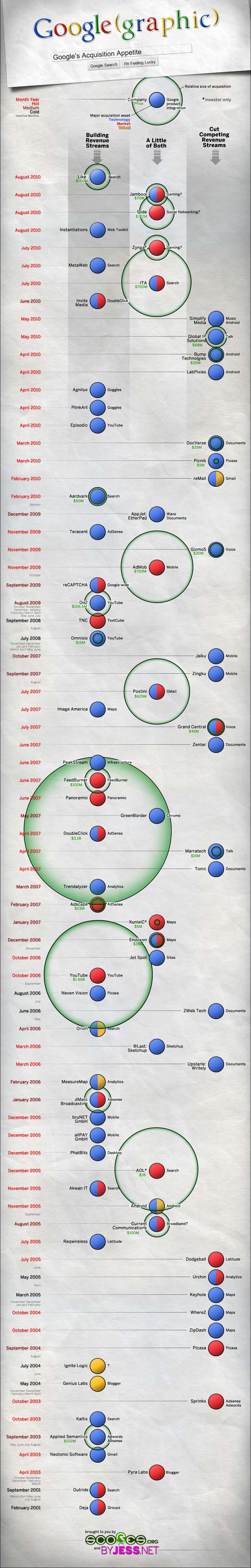
Scores.org has an interesting infographic that shows Google's acquisitions through the past 10 years, starting with their purchase of Deja, which became Google Groups, right up until their most recent purchase of Like.
One of the things that stands out the most when looking at this vertical graph is how much Google's appetite for acquisitions has increased. They bought three companies in July, and already another three in August of this year.
To be honest though, it takes longer to figure out how this graphic is trying to present information than it would to simply view these statistics laid out on a spreadsheet. And that's my general beef with most infographics.
On the other hand, I probably wouldn't have taken the time to look at a plain-jane spreadsheet of this information, so I guess pretty pictures aren't going away any time soon.
Source: http://www.downloadsquad.com/2010/08/26/google-acquisitions-infographic/